A blog dedicated to 3 of my passions in life: food, fashion, and design. Stay tuned to hear all of my thoughts, ideas, and opinions on things related to these 3 things. I'll have new recipes, new fashion ideas, and new decorating ideas to share. Life is so much better if you are well fed, well dressed, and happy in your home!
Thursday, June 30, 2011
Problems with Comments
Stay tuned, I have a couple of new posts coming soon. I promise!!!! My entry is almost complete and it is stunning, even if I do say so myself! ha ha ha
Thursday, June 16, 2011
Parade of Homes–Ideas I’m going to “Borrow”
Every year in my little town we have a Parade of Homes. It is an event where all of the top builders in town showcase their custom homes. They have 3 neighborhoods set up with anywhere from 5 – 10 houses in each one open. You pay $10 a person (money goes to a charity) and you can tour through the houses at your own pace. Well, we’ve been to 2 of the 3 so far. I’m hoping to still make it to the 3rd neighborhood but time is running out so we’ll just have to see.
The first neighborhood was in a newer development but not what I would call a ritzy area of town. The houses were all priced around $200K. It really looked to me that most of the houses there were basically one step above a starter home. The bedrooms were all super small but they did have open floor plans and most had granite, wood floors, and tile. I wasn’t impressed with a single house there…AT ALL!
The second neighborhood was in a much nicer, much more affluent area of town. The prices of these homes were in the $500 – $700K range. The first one we walked into was pretty much my dream home! I loved just about everything about it. There were just a couple of drawbacks or it would have been perfect. Here it is from the outside:
I didn’t get many pictures of this one though because I was so paranoid. My daughter kept telling me you aren’t supposed to take pictures but I swear there was no sign or anything that said that. I warmed up a little later and got some pictures of the house she loved though so I have some of them to show later. The things I didn’t like about this house was there were too many faux finishes on the walls. It was all dark and cozy which I really do like but it was almost too dark. But, the master bedroom, bathroom, and closet were perfect. The yard was almost perfect. They had this glorious pool with a waterfall and then a huge patio with an outdoor kitchen, a sitting area, and a dining area and all of it was surrounded by these retracting shades! The downside to it was that was all there was. There was no other yard. It would have been perfect if they had about half an acre of land to go with it but we need some running room for the puppies. Otherwise I would take this house anyday!
Now to show some of the details that I loved. I’m not really sure what house each of these were in, but they all gave me ideas that I can’t wait to implement!
First up…
I adore this light fixture. It was so interesting! I’m not as hip on the faux finish on the wall and ceiling but I don’t hate it either so it’s ok.
I took this picture because I’m so into orchids right now. I actually have my entire back wall in my living room covered in all my orchids. They are rocking too! I have almost all of them blooming again for the second time. I took this picture because I loved how they used something cool and interesting as the support stick. I’ve just been using ugly green sticks that came with the orchids when I bought them. I want to find some cute curly Q sticks and replace the bland with the bling!
How cute are these? I’m thinking they are just paper mache and then covered in print. I thought they were super cute though.
This picture isn’t that clear but I’m trying to get the wire mesh flowers. I wonder if I could get some wire mesh from the hardware store and make flowers with them? These were really cute.
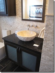
This granite is the exact same granite we have picked out for our hall bathroom. I’m even happier with it now that I see it in place here. I don’t think we are going with a sink like that. I want ours more smooth and clean lined. But we are going with a bowl sink like this.
I thought this clock was super cute. I also think it would be pretty easy to duplicate. You would just need a large canvas, then cover it in some cute vintagey looking scrapbook paper, paint the numbers, insert a clock kit and voila…instant large custom clock.
This staircase is from the house that my daughter loved. I’ve discovered that my taste and her taste are entirely different in relation to our homes. She likes clean modern sleek. I like cozy, antique, classic. She loved this staircase though. The “railings” are actually steel cables tied between each post.
This was my son-in-law’s dream media room. He likes the idea of multiple TV’s to watch lots of games instead of just one big huge screen. I almost agree with him even though I’m not a huge sports fan.
These kids beds were ingenious! It really gave the room more space too because you could put both beds against one wall but they wouldn’t be having someone’s feet in another’s face!
This artwork was cool! It was just a canvas, covered in print, then painted in an overall color. Then they painted on the car. It would work with anything though, not just a car. The overall effect was very nice and very diy’able!
OK, check out this bed! How cool is this? I have no idea what those are made of but I loved them. I really tried to check them out too and I still have no idea what they made them out of. Anyone else have any ideas? I’m dying to figure out how they did this!
This bed looks like it is hanging from the ceiling by the ropes. It is just decorative though. The bed is actually anchored to the floor. The weight is not supported by the ropes, but it still looks cool.
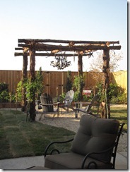
We both loved this pergola made from rustic cedar. It made us wish we had more of those cedar trunks that we got from our yard this summer.
There was only one house that had a scrapbook/craft room set up and this was it. But, I did get this wonderful idea from it. They hung paper up by running a dowel rod through the roll and then threading the dowel into metal corner brackets with holes in them. I’m going to do this for a gift-wrapping station I’m working on. It is a great idea!
I loved this closet and these shoe racks. I’m not sure if I could use them because I keep my shoes in their boxes but it looks cool regardless!
The pull down rods are the best thing I’ve seen in closet innovations! You can store your off season clothes up high and then when you need them you just pull down that little handle and you can reach them again. How clever!
This was in a boys room. They just hung up a metal sheet and used it for a magnet bulletin board.
I loved this baby’s room. I like the idea of hanging a decorate “chair rail” pretty high, then hanging decorative knobs on it and then hanging things from it. I’m definitely going to borrow this idea somewhere in my house.
I have no idea how they did that panel wall but it is amazing. The pink part is cut out with all the designs and then the back is painted black. It’s kind of like it’s a laser cut box on the wall but how they did that to that scale is beyond me. The end result was super cool though.
So, that’s it. Those are all the pictures I took. Did you get some good ideas out of any of them? I know I did.
PS Sorry for the over-usage of the word COOL…I can’t help it. It was all just so, just so, just so….COOL! ha ha ha
Thursday, June 9, 2011
What can we do?
So, here is yet another interruption in my Entry-Room Re-Do posts. But, I need help! I’m really hoping someone out there will happen upon this post and have the perfect solution for us.
Now for the story…
We recently renovated the room off of our bedroom and make a master bathroom and closet. In doing so, we had to put another septic system in our front yard for the new bathroom. They had to tear out our existing (really crappy anyway) front patio. So, we have been looking to redo the entire thing. We have water issues to deal with because our house sits so low. Our front door is equal to the ground level, so we can’t have a raised porch at all, so we needed the porch to slant towards the yard. Well, we looked and looked and finally came up with what we wanted. Then we got some bids on it. We picked the guy to do it who assured us it was no big deal. The bid was $3100. For that price we were getting a front porch, a walkway to the driveway from the porch, and a concrete footer the length of the house to frame a flower bed. We wanted the concrete colored and patterned.
We picked our pattern (a cobblestone pattern) and then we picked our color (a reddish brick color with dark gray grout lines) and then we saw that we could also have a design in it so we wanted the state of Texas in the walkway right before you get to the porch.
The guys came and did the work. Unfortunately for us, when they were actually pouring the concrete and doing the pattern work we weren’t there. UGH! This is what the Texas looks like:
It is AWFUL! They put the cobblestone pattern throughout the Texas but have it rough and not done right next to it. They also somehow incorporated part of New Mexico into Texas! It is so bad!
We asked the guy to come out and talk to us and he refused. He knew it was a subpar job. We ended up paying him $2000 total and calling it done at that. But, now we have this mess! How can we fix this?
I was thinking if we could somehow ground out just the Texas part and then fill it with thinkset or something to make it smooth then it would probably look ok. I can live with the 6 footprints (yes 6 freaking footprints in the patio!) but the Texas I just can’t live with. Our only other option that I can see is to tear it completely all out and start over. Since we already paid so much I’m hoping that isn’t the answer.
Needless to say I will tell every single person I know to not use this guy for any work. Steve Hunesto is his name by the way! Stay far far away from him!!!!!!
So, anyone have some expert concrete knowledge they can share? How can we fix this?
Tuesday, June 7, 2011
The Entry Room Re-Do Part 2…A Sneak Peak of the Gallery Wall
I know I haven’t been very good about posting. Man, this summer is just getting away from me…big TIME! But, I didn’t want to just not post until everything is done so I’m going to do a sneak peak post now and when it’s all said and done I will do the room some justice with a full post.
First of all, let’s take a look at my gallery wall that is slowly being developed. To put it mildly, I’m in LUV! I really love it all. To start with, here is what my room looked like before:
OK, now this is not the best picture I realize…and my “gallery wall” is actually looking more like a “gallery floor” right here, but bear with me. I’ve been looking for the picture I had of my previous gallery wall and I can’t find it! I know I took a picture of it too, so you’ll have to forgive me and just take my word for it, mkay? I had a small grouping on the wall on the right hand side, right by the doors. You can almost see the quote I had done in vinyl words down there still. I had the quote “framed” in the large gold mirror that now lays in the center of the floor here in this picture.
The two long boxes you see on the left are the left over Ikea shelves I got for my bedroom closet makeover that I didn’t have room for. Those boxes have been sitting there since July of last year! I kid you not. Yes, I’ve been getting really tired of them. I’m happy to say, they are now out of there and being used in my storeroom cleanup job from a few weeks ago.
The cabinet you see on the right is an old china cabinet I got when one of my husband’s aunts passed away. Sadly it wasn’t old enough to be really classy looking, more like a 70’s throwback. I had painted it the dark green several years ago. This puppy is getting a makeover with the room redo. (more on that one later!). It’s really coming along though and I hope to finish it next week.
The thorn in my side is still the book case with all the DVD’s on it. Where do you put your DVD’s? How am I ever supposed to have them look classy? As far as I’m concerned they just look so crappy, no matter what I put them on or where I put them. Unfortunately I haven’t resolved that little dilemma yet. I’m very anxious for any and all suggestions on how to store movies. The book case in the center is going to get a few touch-ups and redo’s as far as what I have displayed on the shelves. The Hubs and I are in a pretty heated argument about them right now. I REALLY want to paint them and he has put his foot down and said no way in double hades are you to paint them. Sniff Sniff Sniff…I hate when I don’t get my way, don’t you? You see the problem I have is my husband loves anything dark wood. I swear our entire house would be in cherry dark wood if he got his way. I want to paint them a light creamy color to just bring more lightness into the room. I haven’t given up entirely yet. I may have lost the last battle but I haven’t lost the war on them yet!
The table in the middle of the wall on the right is one that I got at a garage sale when I first moved to Austin to go to UT in 1980. I’ve been lugging that puppy around all this time. I think I paid $50 for it then, which was a LOT of money back then for a poor struggling college student like myself, but I’m so glad I got it and I’m also so glad I sill have it.
The chairs are old chairs from my husband’s office. I love the shape of them but I hate the fabric they are upholstered with. I really want to try and re-upholster them but I may decide to do a slip cover (if I can find one that will fit them) or pay someone to do them. I’m just nervous because the seat cushion doesn’t come out so I’m not sure how I’m supposed to re-do it if I can’t get it off, you know?
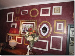
So, there is the room as it was. Now, you’ve already seen my custom chalk board and now to show a sneak preview of the gallery wall. It’s turning out pretty darn good if I do say so myself. I have a few tweaks and such to do to it. I want to put more things in some of the frames and not have them all be so empty. I also have a few more to hang in some of the barer places. But…here is what it looks like now!
I’m not really certain on the lamp there yet. I love it but it seems a little big for the space, so I may be changing it out. I bought a lamp at Goodwill I will be painting and I’m thinking of replacing this one with the Goodwill one. It will be a turquoise color. What do you think? Do you like it so far?
Stay tuned…there is much more to come!


